Ciqlo
UX/UI Design + Motion Design + Illustration
Problem –
Group work stands out as a pain point amongst students, and in many cases even professors. More specifically, the inefficient way that groups and teams are created for the assignment. Whether groups were created in a manual random fashion, alphabetically, or created by the students themselves (who will often latch to their friends, for better or worse), scheduling incompatibility will often lead to a frustrating assignment, one with an unbalanced workload and ultimately little benefit for the students.Goals –
Create an application that can aid professors by automatically creating groups of students with schedules that are the most compatible with one another.Role–
UX Designer, UI Designer, Motion Designer, IllustratorSoftware–
Figma, Xmind, Adobe XD, Adobe After Effects, Adobe IllustratorTimeframe–
9 Weeks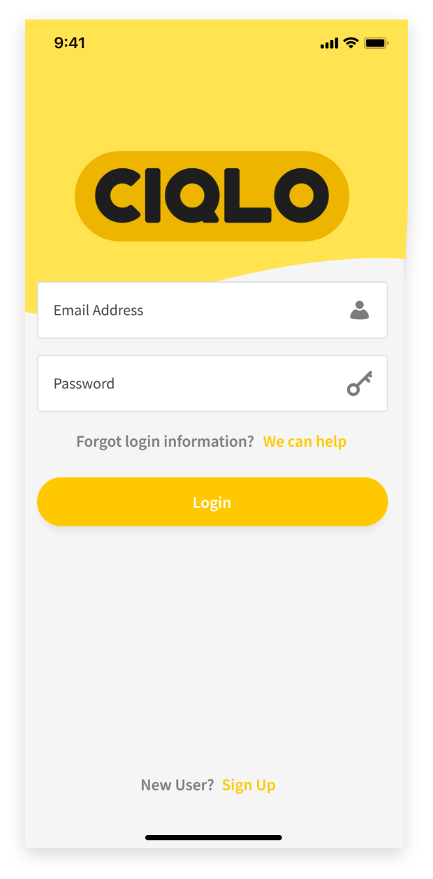


Research –
Before developing an application that solves the problem defined above, it was important to make sure that it was a real problem that people in school(professors or students) regularly faced when doing group assignments.
Survey –
I conducted a survey with college students and professors focused on the concept of group work, and their current and past experiences with it to gauge demand and identify the pain points, and to give us a problem statement (that was seen in the description)...the following are the results from the survey
︎

Competitor Analysis –
I researched to see if there were other applications or companies that were already doing easy group or team making for classes, and found that there are no direct competitors to the product we are proposing. Although there are no direct competitors to the product, there are quite a few indirect competitors such as the following (seen below
︎)
- Microsoft Teams
- Slack
- Crew Messaging and Scheduling
Crew Messaging and Scheduling is aimed at the workplace, and is the only direct competitor with a built in scheduling functionality. Users can be assigned shifts, change availability, and even swap shifts with other employees, but this is done manually, and is not aimed at team or collaborative work on projects as this proposed product is.
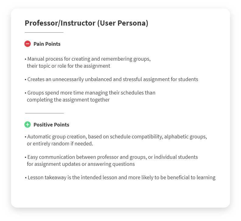
User Personas –
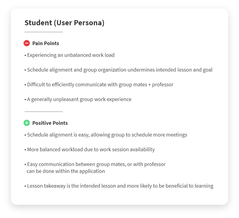
Below are the pain points and positive points of our potential users (Present or past College students or professors) that were informed from the data acquired from the survey, which was documented earlier... ︎
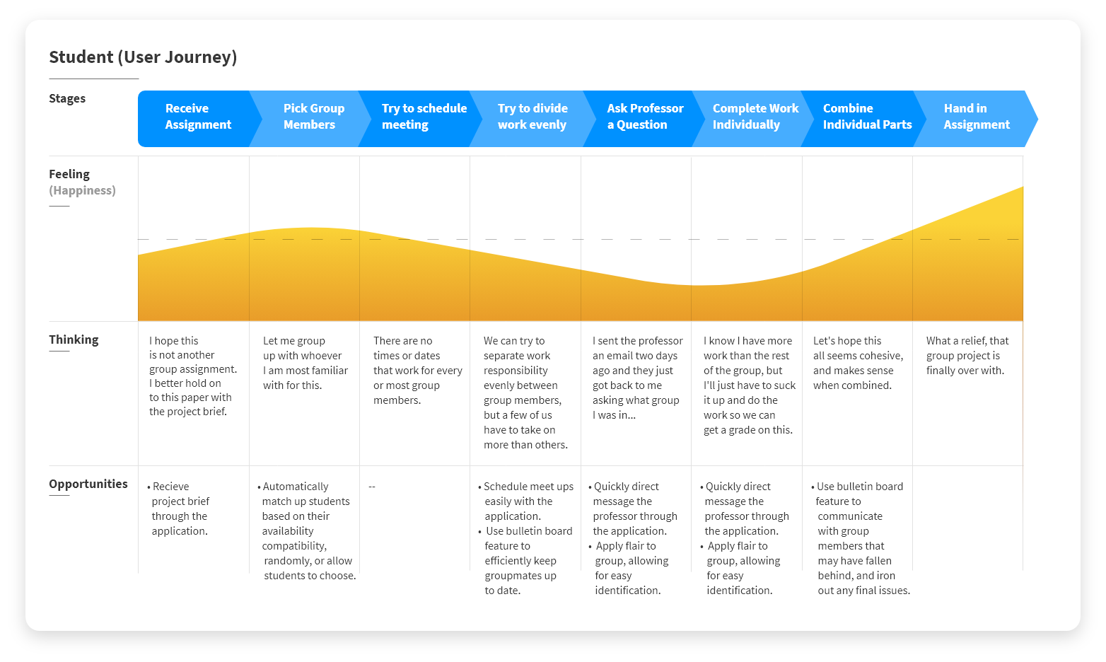
User Journeys (Scenario) –
Below are the pain points and positive points of our potential users (Present or past College students or professors) that were informed from the data acquired from the survey documented aboved.

Defining MVP Features –
After creating scenarios that our user personas go through, we had a starting point of how users could, and would interact with the product we were proposing. We created a list of the core features that would be needed to create the minimum viable product. The core features are as follows...
- Allow Professors to group their Students for assignments in a variety of ways, such as...
- Optimized : Match group Members based on their availability compatibility
- Random : Group students Randomly
- Alphabetical : Groups students Alphabetically
- Manual Creation : Allow the Professor to Match their students manually
- Allow for easy and fast communication and file sharing between Professor and Students, and classmates amongst themselves, through the group bulletin (Group messaging) or one on one direct messaging.
- Provide students and professors a way to communicate without sharing or exchanging their phone numbers or personal email addresses.
Design –
After coming up with scenarios and the MVP features that our user would have access to, I had a basic starting point of how users could, and would interact with the product we were proposing.
User Flow Map –
To avoid confusion between myself and the developer and be most efficient, we decided a set of words for the different aspects of the application to use when communicating. To explain the words in the example of Professor and the Students, the phrases were as follows...
Organizer = Professor
Participant = Students
Organization = Class
Teams = Groups of Students within Class
With everything clearly identified, I moved over to XMind to create the map of primary, secondary, and tertiary screens that the users would go through, and settled on two options as shown below. ︎︎︎
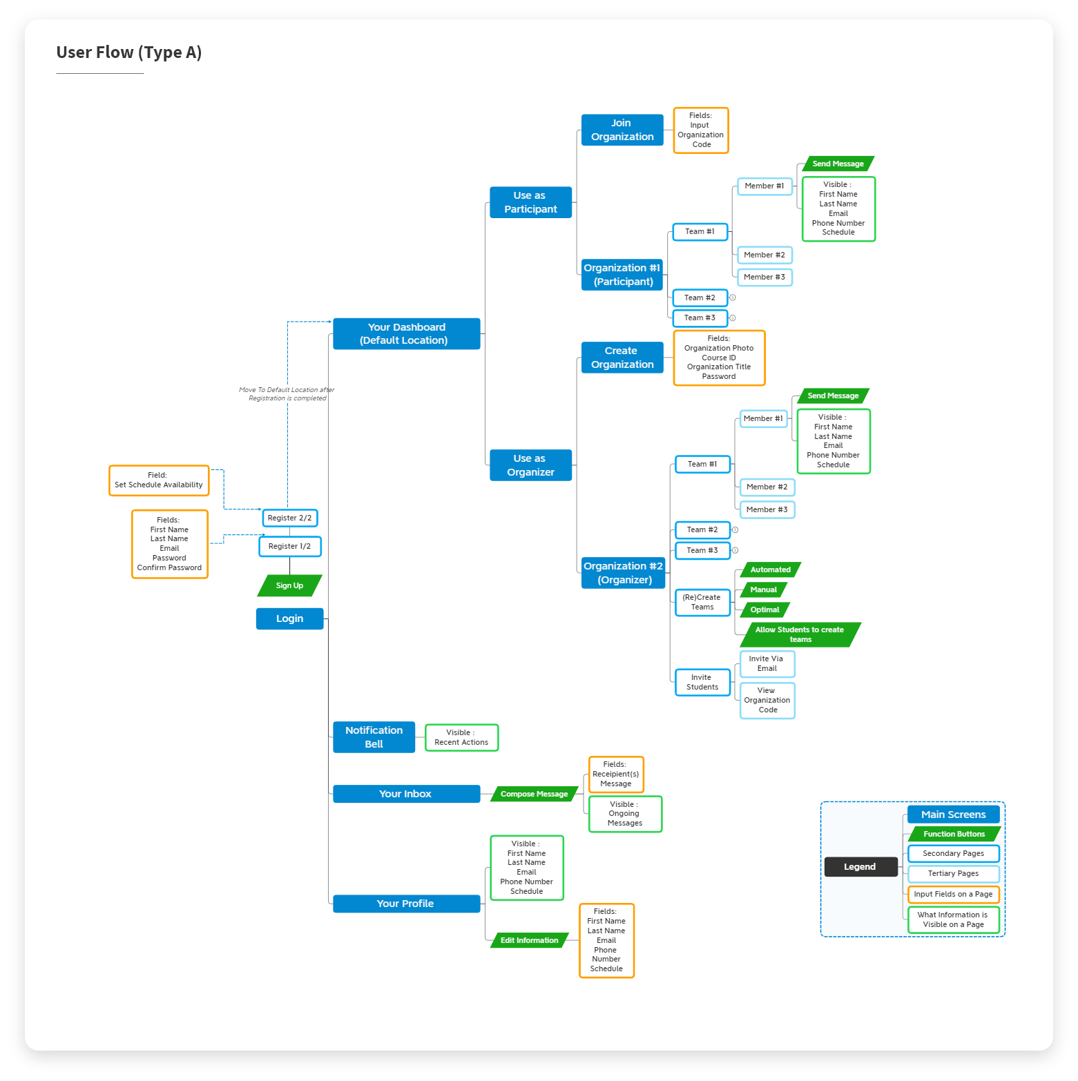
︎︎︎ Type A is a guided linear experience that is built around having users choose how they are intending to use the app, as either an Organizer (Professor), or a Participant (Student). For example, after selecting "Organizer" users are only shown the Organizations that they own and are given the ability to create a new Organization (Class). While if the user chooses to use the app as a Participant (Student), they are shown the Organizations (Classes) they have joined, and are given the ability to join other Organizations (Classes).
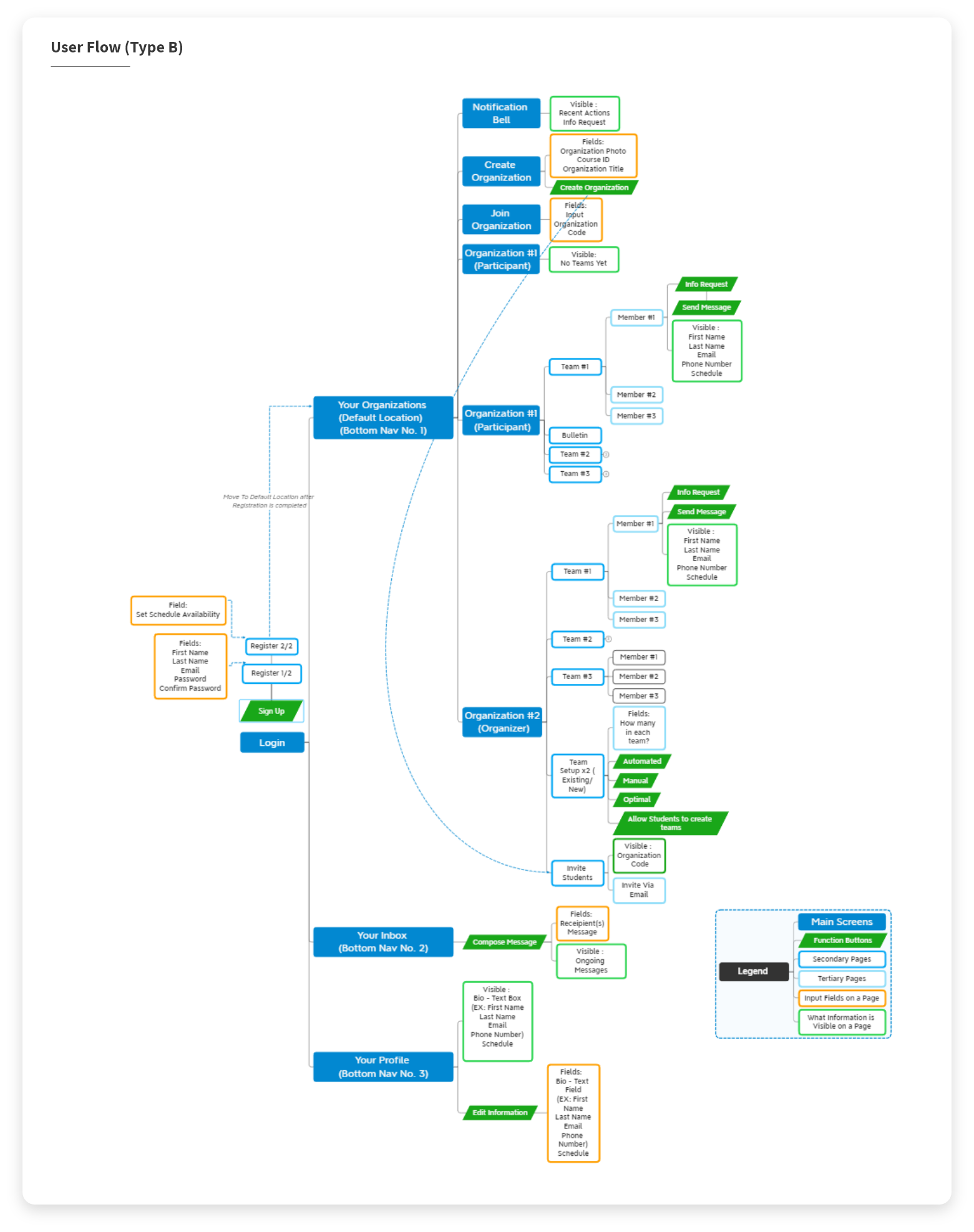
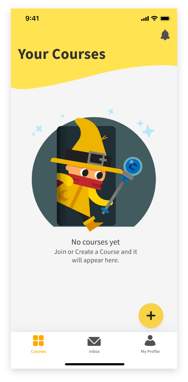
︎︎︎ Type B, is a less linear experience, simplified by removing the choice of using the app as either Organizer or Student, and allowing users to join organizations, create organizations, and manage organizations all from one place. This option adds a bottom navigation bar, for jumping between your organizations, your profile, and your inbox.
Sketches + AB Test –
I then sketched out the main screens for both Types, A and B (Sketches seen below)...
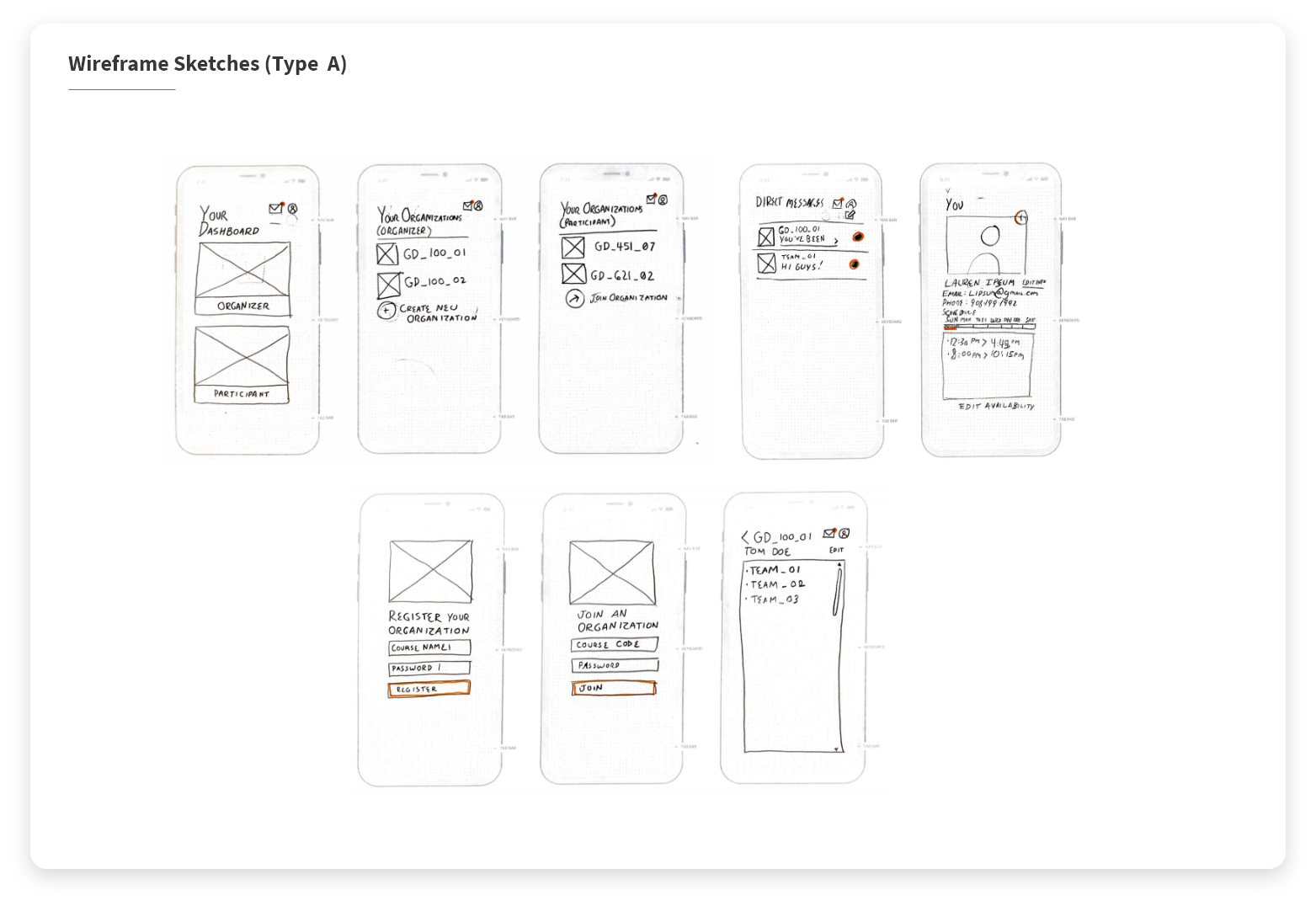
︎︎︎ Type A (Linear)
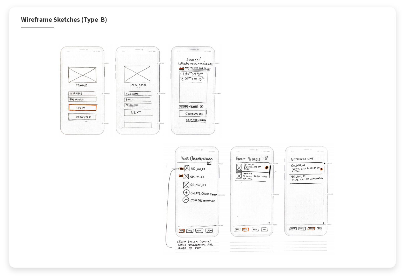
︎︎︎ Type B (Not Linear)
- 3/3 Students Preferred Option B (Bottom Navigation, Non Linear).
- 2/3 Professors Preferred Option B (Bottom Navigation, Non Linear).
- 1/3 Professor Preferred Option A (Guided Linear Experience).
The students unanimously preferred Option B, while only the two of three professors preferred Option B. The more linear style (Option A) was preferred by the oldest participant, who added that Option A would prevent them from "Screwing up" and using the app in an unintended way, locking them to their role from the beginning.
Wireframes + First Prototype –
With the information from the AB Test, I went ahead with Option B, and created wireframes for each of the screens within the app, within Adobe XD. I specifically chose Adobe XD for the wireframes because it allows me to follow up in creating a prototype from them rather quickly. Wireframes can be seen below. ︎︎︎
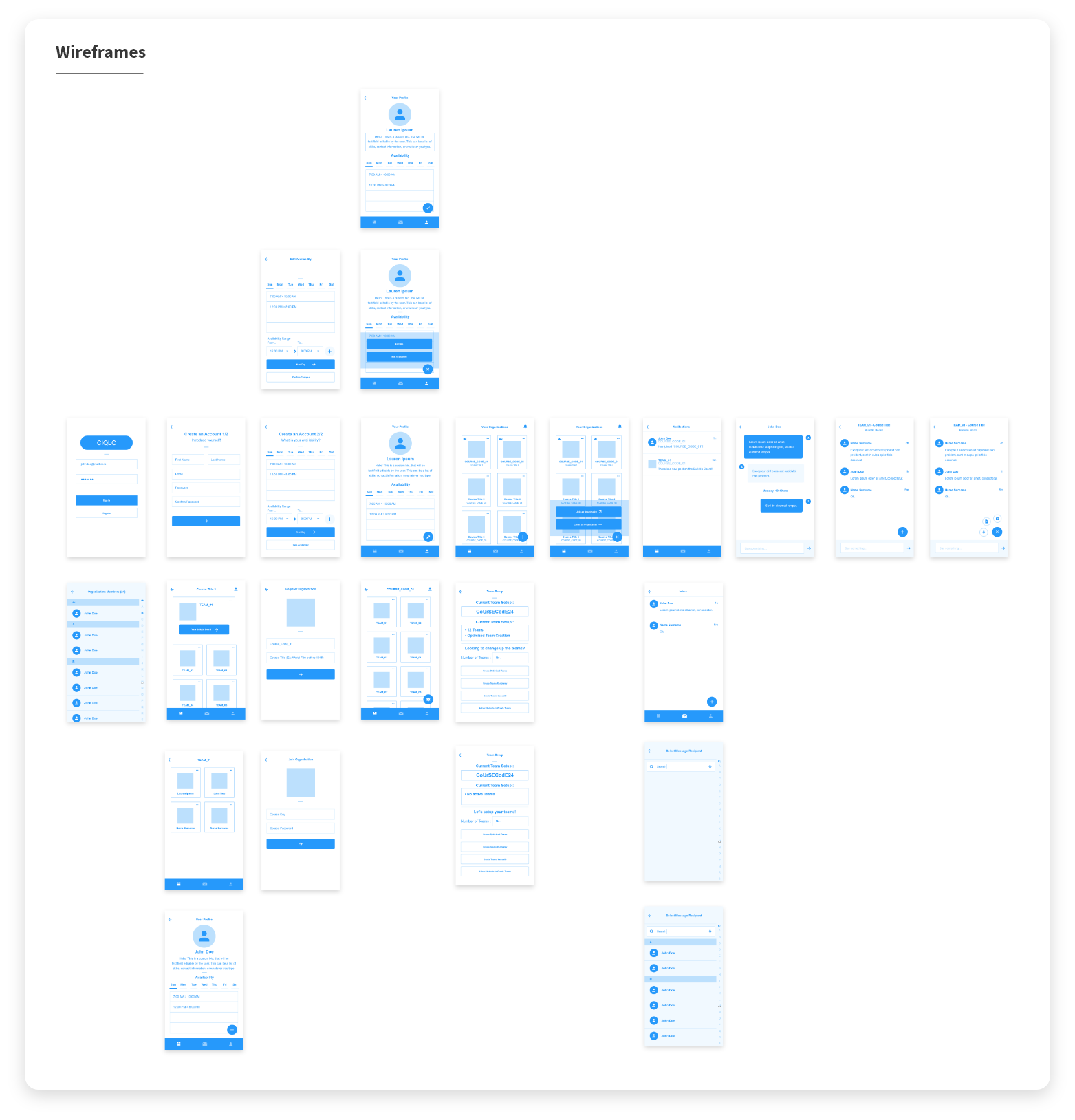
Once the wireframes were complete, I created a prototype of the application using the wireframes. I used the prototype I created to show the application, it's features, and how it functions, to the developer to ensure we were on the same page, and eliminate any chance for confusion. (Prototype can be seen in action below ︎︎︎)
UI Design (First Iteration) –
Once the wireframes were complete, I moved on to designing the look of the app. Before doing so, I defined the design goals.
- Create an interface that is inviting and easily usable for professors and students of any age.
- Create an interface that enables users to be identifiable without personal photos
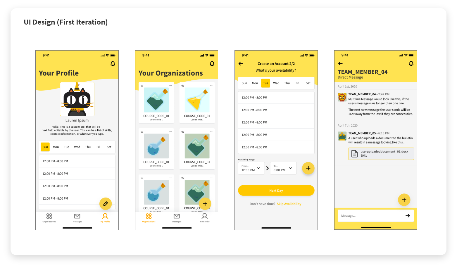
After designing the first version of the UI, I created a prototype (check it out here ︎︎︎ ) and wrote two Usability Testing Scripts (which you can read in full here : Situation A ︎︎︎ and Situation B ︎︎︎) to use for testing with six (6) users, and some quick follow up feedback survey (questions here : Feedback Survey ︎︎︎ ) for after the test. The six users are split into two usage situations. Situation A has the user using the app as a student. Situation B has the user using the app as a professor.
Summary of the test results:
Failures :
-
5 of 6 (2 from Situation A, 3 from Situation B)(83.33%) users ran into the same issue while navigating from the home screen into a course, and then into a team, stating they felt lost. Some users state they feel this way due to the similarity of the layouts back to back.
- 4 of 6 (1 from Situation A, 3 from Situation B) (66.67%) users state issues with the floating action button, difficulty with reading button labels and navigation of them.
Successes :
- 5 of 6 (83.33%) users noted that the illustrations/characters were something they liked about the app.
- 4 of 6 (66.67%) users noted the color palette was something they liked about the app.
- 5 of 6 (83.33%) users felt that this application would benefit both students and professors, while also improving the experience of participating in group work.
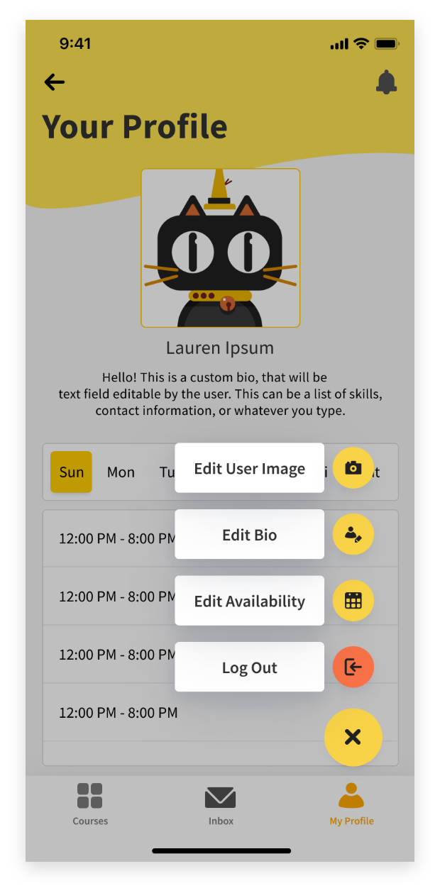
UI Design (Second Iteration) –
After reading through the results, I moved to correcting the failures of the design. A Before and after for each of the failures and their solutions are shown below…
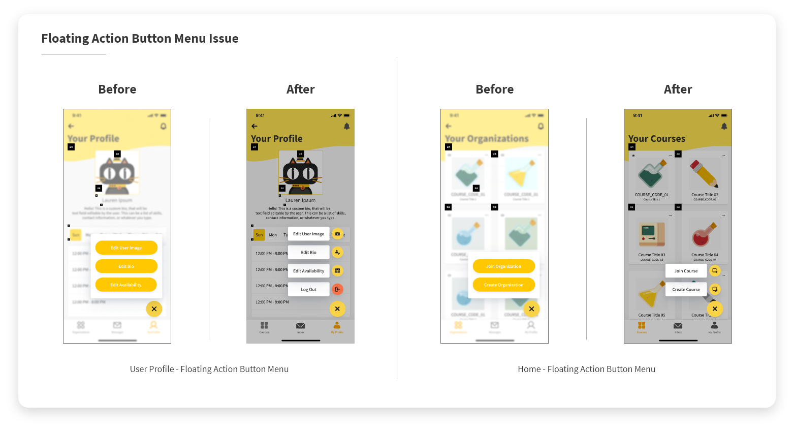
Floating Action Button Fix ︎︎︎
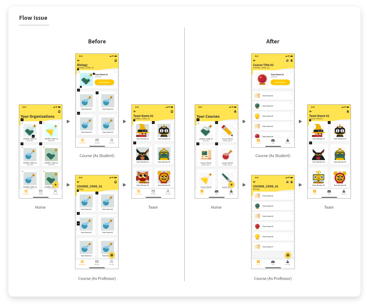
Flow Issue Fix ︎︎︎
Below are screens from the second interation of UI Designs ︎︎︎. The full redesigned prototype can be viewed here ︎︎︎. To see the pages in a non prototype fashion viewed here ︎︎︎

During the period of fixing the failures that were identified through the usability test, I also created many more user avatars, teams icons, and class icons.(I go into more detail within the “Illustration” section below)
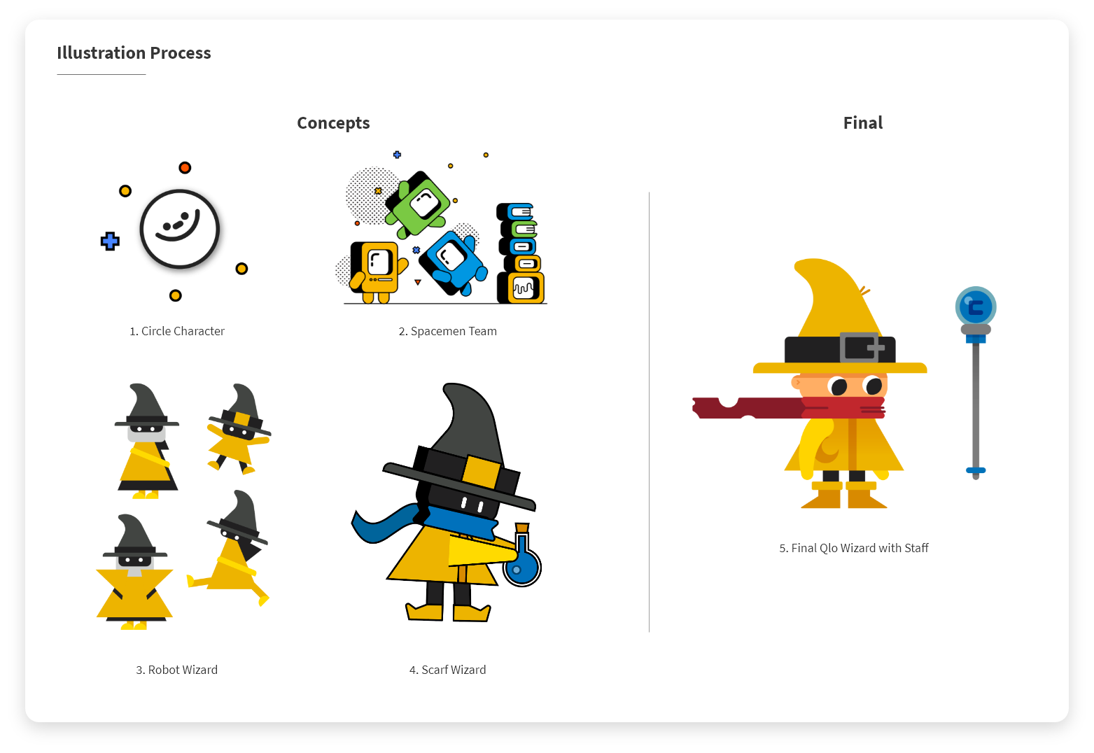
Illustration + Motion –
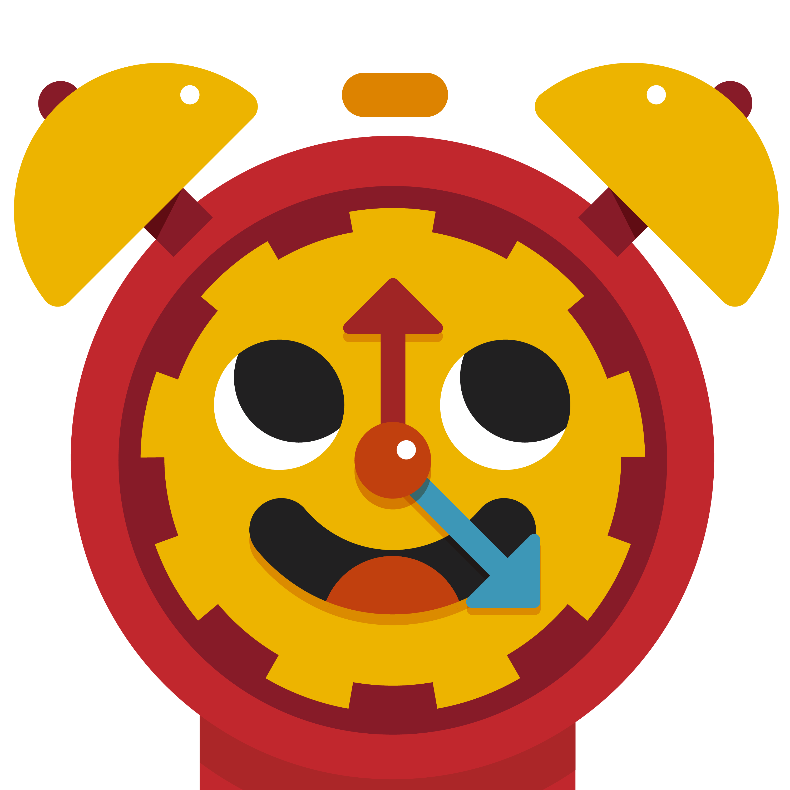
Before deciding on the final characters and illustration style that are within the app, and prototype, I came up with concepts for a character that would be seen throughout the app which would be inviting and pleasant for users to look at. Below are various concepts that were tried before deciding on “Qlo” the Wizard... ︎︎︎
I also made a test animation of “Qlo” in Motion, seen below…︎︎︎
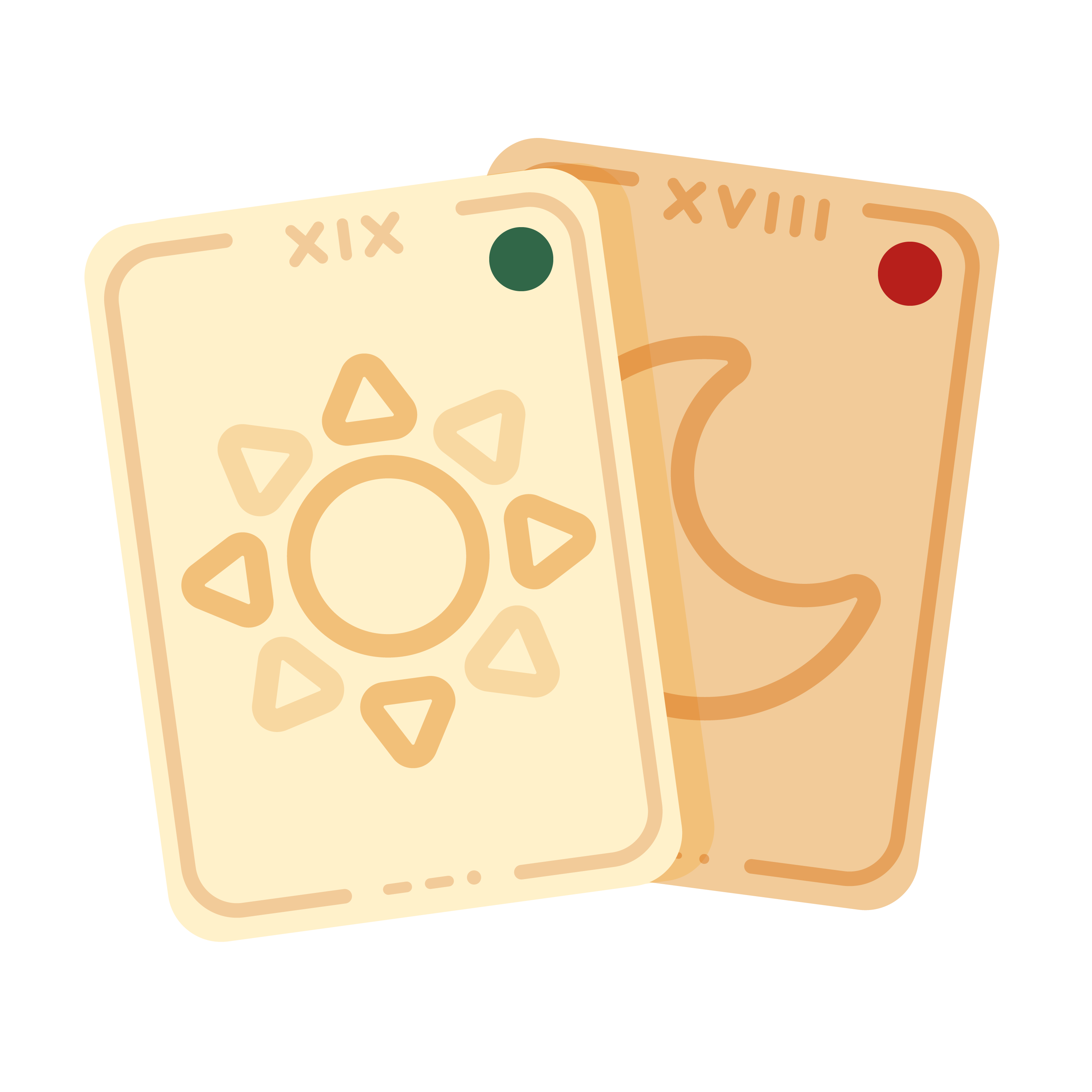
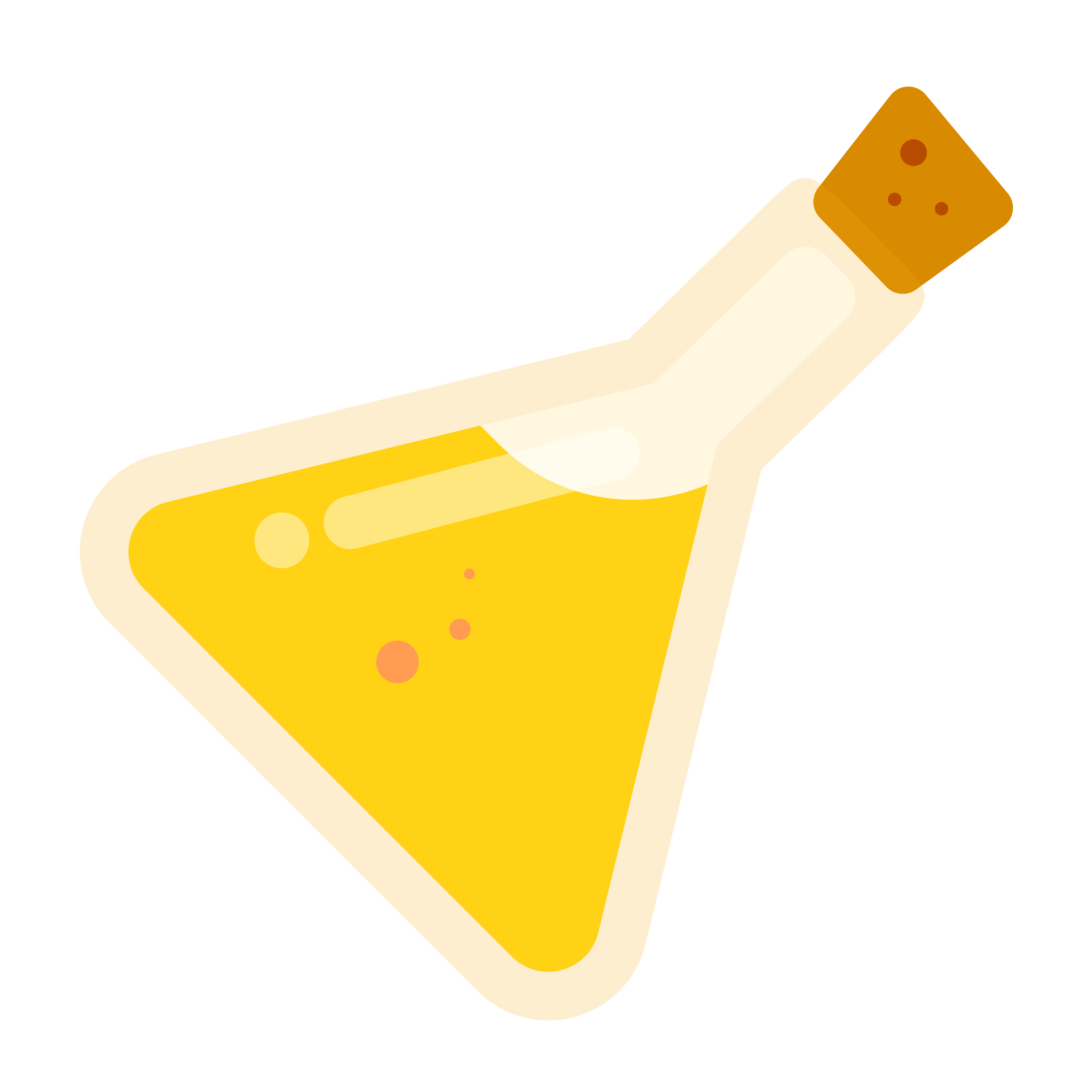
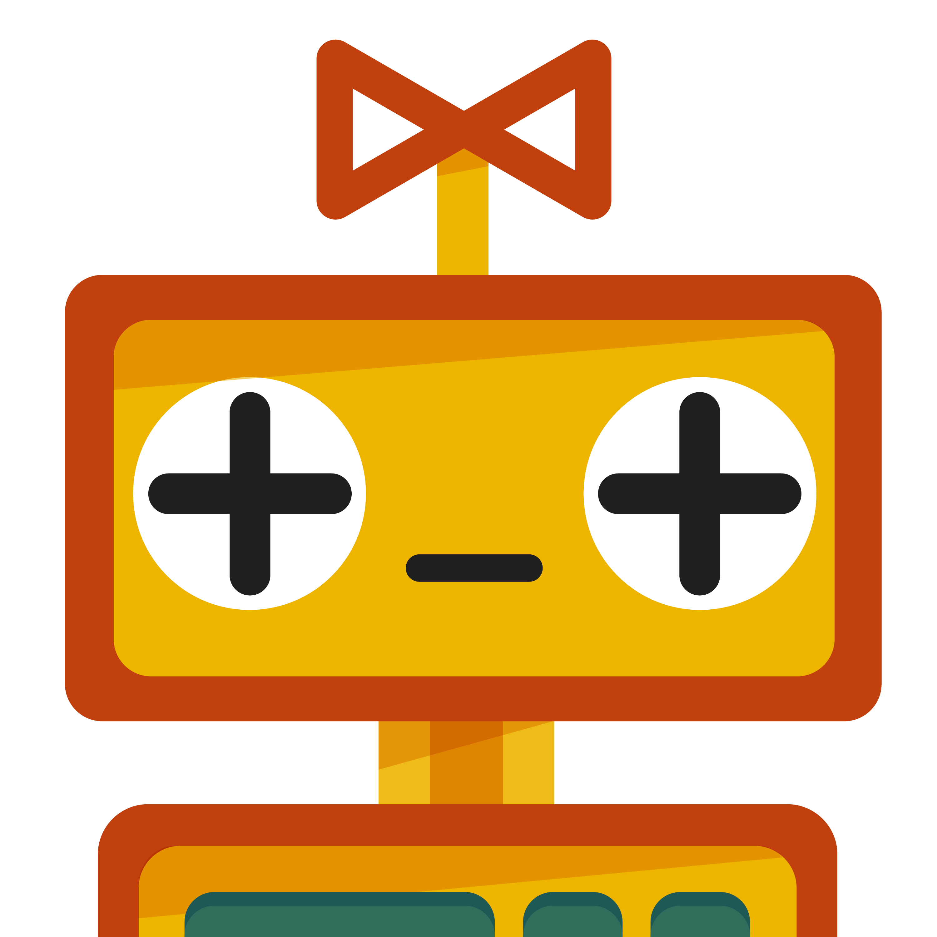
The user avatars are mainly characters that can be used in place of a profile photo, featuring characters such as Qlo the Wizard, a Cat, a Bat, a Frog, or an Owl, amongst others. Team Icons include things such as cards or crystal balls. Class icons vary from objects such as a computer or a paintbrush, to things that can be applicable to any class, specifically the book that can show any letter of the alphabet. The set of avatars can be seen below (minus every letter of the alphabet, to avoid being redundant)… ︎︎︎
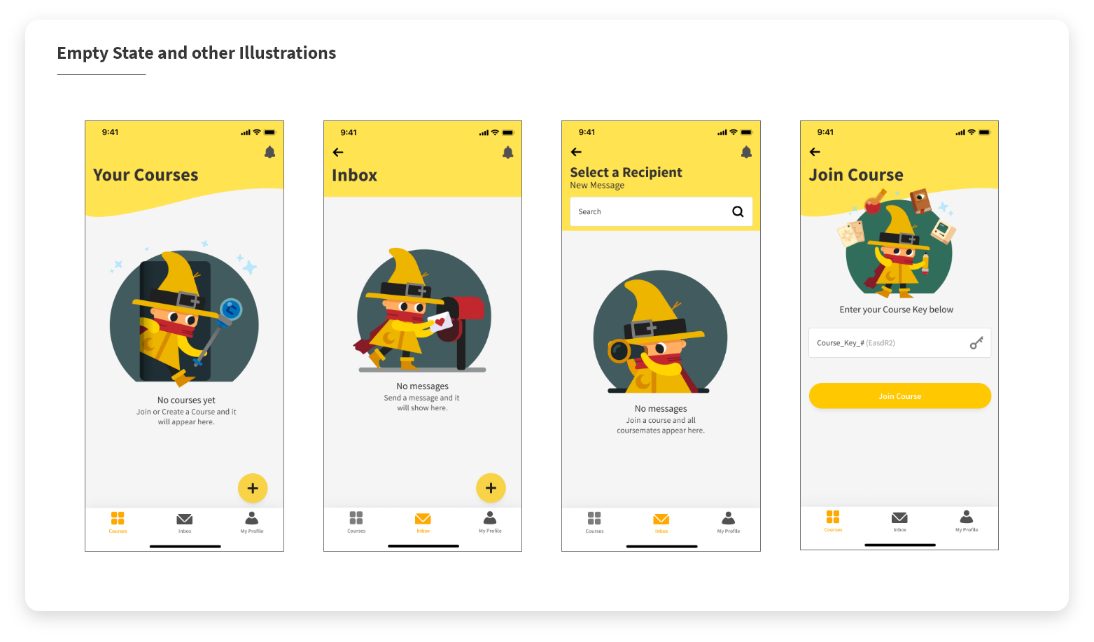
Following the avatars, I created Empty State illustrations for every part of the app that would or could be empty at any time during use. I also created other illustrations for pages that were lacking content, such as the “Join a Course” Page. These can be seen below… ︎︎︎
Finally, I created animations for various microinteractions, loading icons, and even an animated empty state which will be seen throughout the app. I animated each of them in After Effects, and exported them using Lottie. Lottie allows a lot of freedom when animating elements like these, mainly because they do not require any extra time coding to animate, and can be entirely done by anyone with experience in motion design and handed off to a developer who simply implements the code which is created within Lottie.
The floating action button microinteractions can be seen below... ︎︎︎
Click below to see the other Lottie animations I created for Ciqlo... ︎︎︎
Campfire Animation (Course Empty State)︎︎︎
Loading Animation 1 ︎︎︎
Loading Animation 2 ︎︎︎
Notification Bell Animation ︎︎︎
The app is currently in active development, and will be launching on iOS! Check out the latest Ciqlo prototype out here ︎︎︎ or try it out below...︎︎︎
(Figma Embed does not render correctly on mobile. If you are on mobile, click the link!)