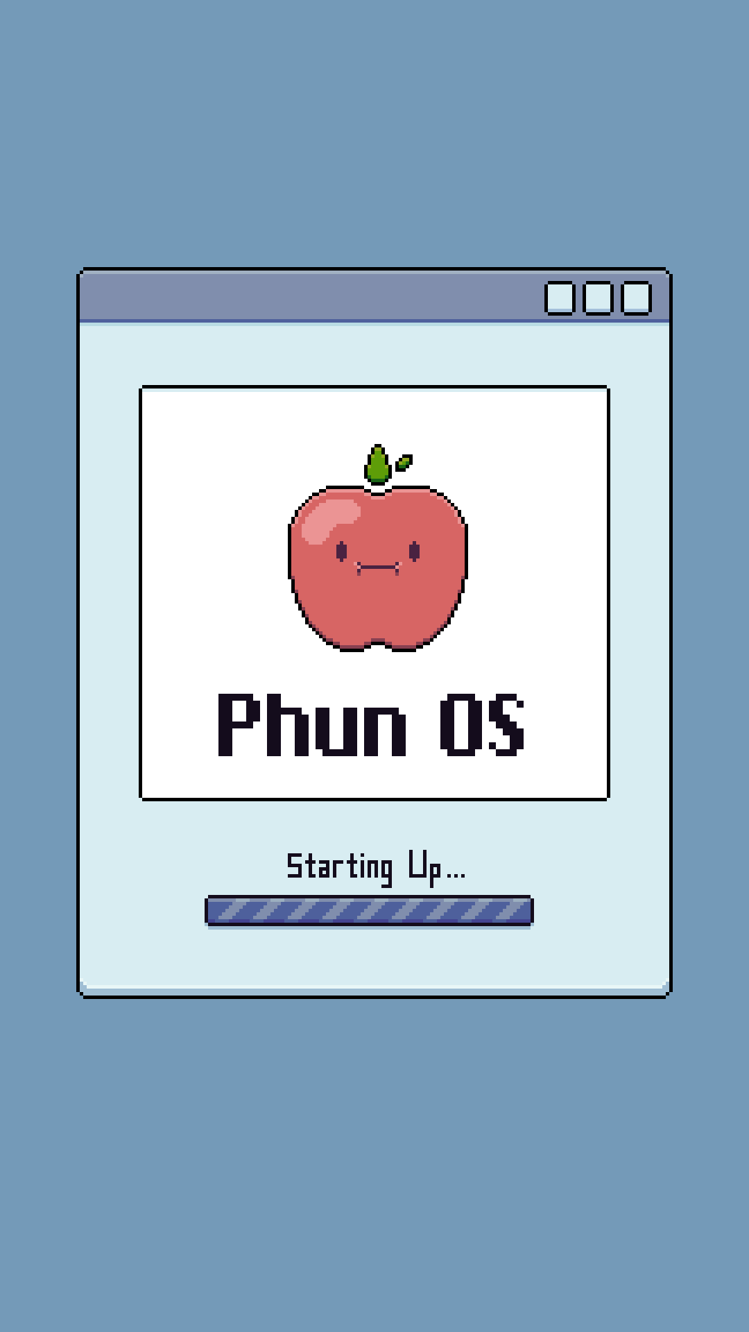
Phun DX
(iOS Theme)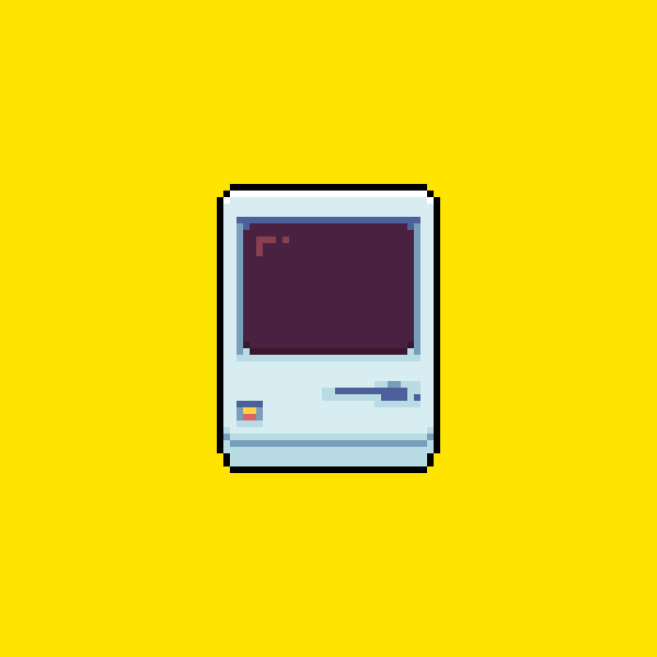
Goals –
• Make a theme that has a personality, is unique, and is fun.• Make a theme with legible imagery. (An envelope looks like an envelop, a campfire like a campfire, etc.)
• Make it functional and work on my iPhone.
The main focus and research with this project was learning about
the history and challenge that comes with a low-resolution
limitation, how crucial legibility is with it, and how I could give the
theme it's own identity with it. Throughout the project I began to
learn things such as the massive importance, significance, and impact
even a single pixel can have, especially when working with these limitations.


Research –
During my research, I learned what it takes to create legible icons, the book "TOG on Interface" in particular, helped me look into the mindset and philosophy these icons were built on. What to include, what to remove, and how to do it within the confines of a low-resolution. This book, being written in 1992, dives into Bruce Tognazzini's philosophy behind his, then current, low-resolution icons. His process involved starting with what was absolutely necessary to communicating the message, and then adding to that and developing it to make it more interesting and clear.
My research continued from there by looking at more early examples of GUI, more specifically, the GUI found on none other than Apple’s Macintosh from 1984. The designs found here, are low-resolution, but achieve my goal of legibility. Things such as folders and documents, look like their real world counter parts, the Trash Can is immediately identifiable as such. The clarity and legibility of the icons that only made use of black and white was inspiring and taught me the importance and impact that each of these single pixels had in communicating what the interface elements were to the user. Since these icons were so limited, they only include what is absolutely necessary to communicate
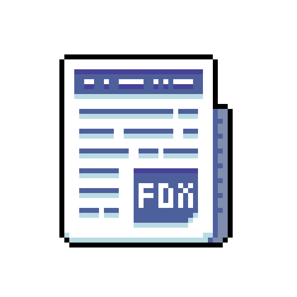
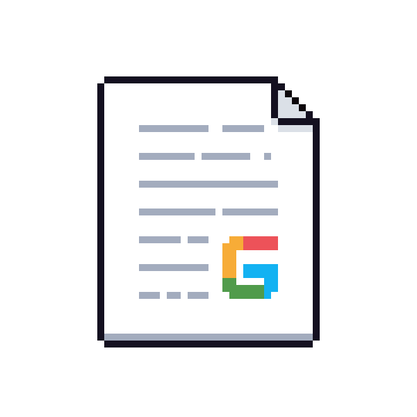
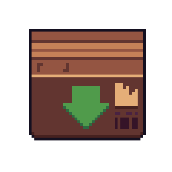
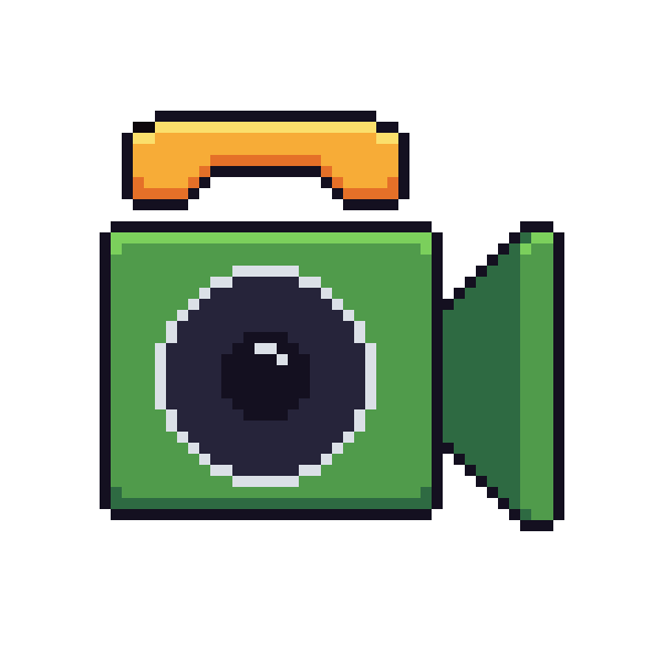
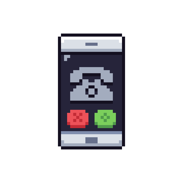
Jumping forward 23 years to 1997 and Mac OS 8, the icons included color, but still maintained a low-resolution (albeit higher than the GUI found in 1984) “Pixel-Art” appearance. This era was the sweet spot for legibility and uniqueness in low-resolution GUI. Icons and UI elements are immediately clear, but they include colored shading, and even small details such as shadows or even mock lines of text on documents and files. These icons perfectly strike the balance in low-resolution GUI, maintaining legibility without sacrificing personality and uniqueness of the icons and UI elements. Due to this, this the era that would serve as inspiration for PHUN, giving room to inject personality into my set of icons.
Process –


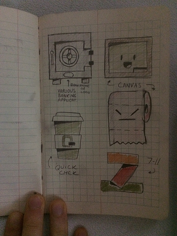
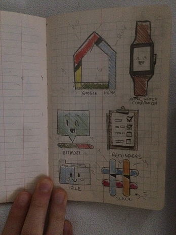
My process behind creating each of these icons began with an idea that I sketched or conceptualized in full fidelity, not limiting myself to a grid initially, helped me come up with some fun and unique ideas for various icons. Some of my sketches shown above show icons that made it over into the final product, while others ideas were cut.
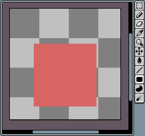
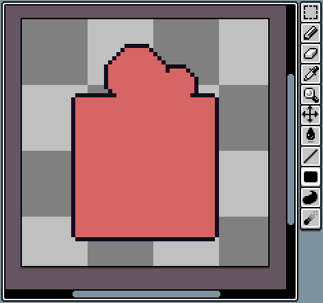
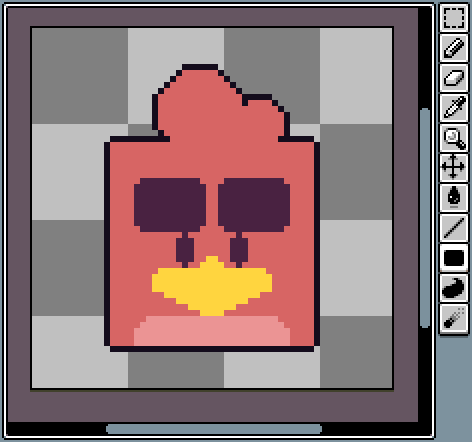

Next, I would hop onto the computer and go through the process of digitizing and making the icon. In the example shown above, I am making the icon for "Angry Birds". Within my process booklet (full thing can be read here︎) I go into further detail about each step of the digitizing process. ( Select pages of which can be seen below)


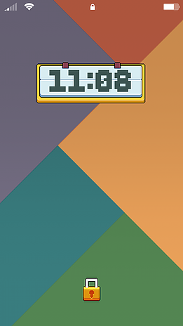
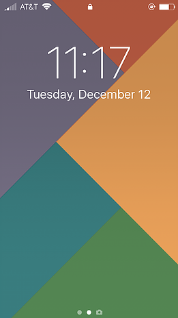
Final –
Before & after shots of iOS using the theme :
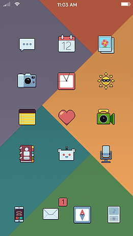

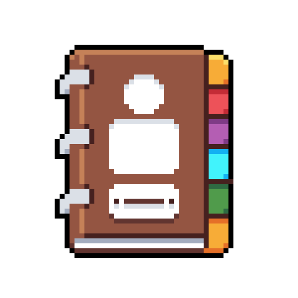
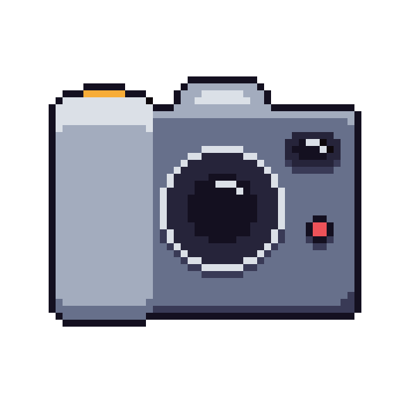
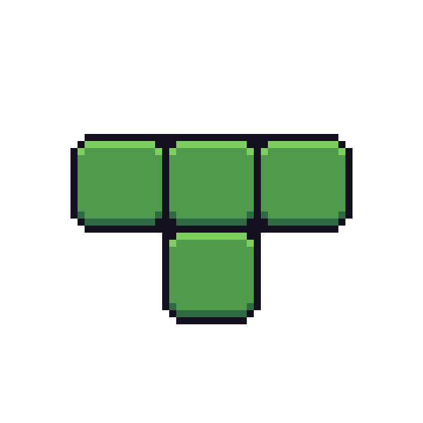
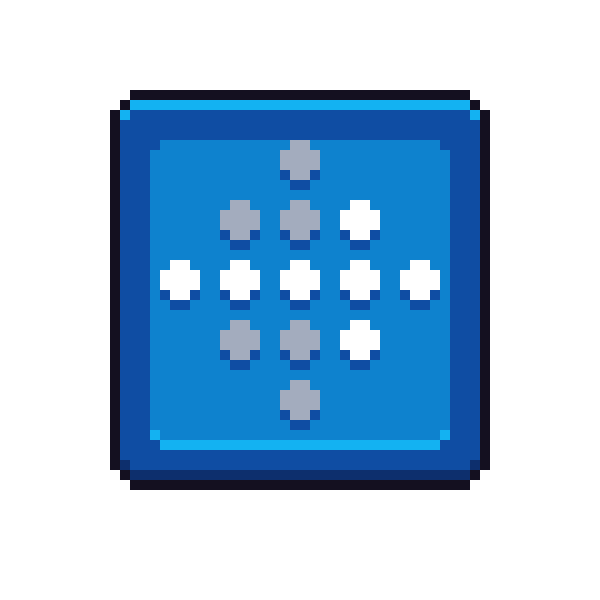
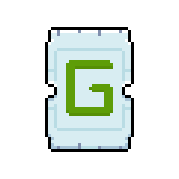
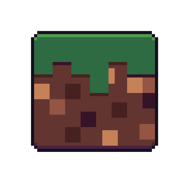
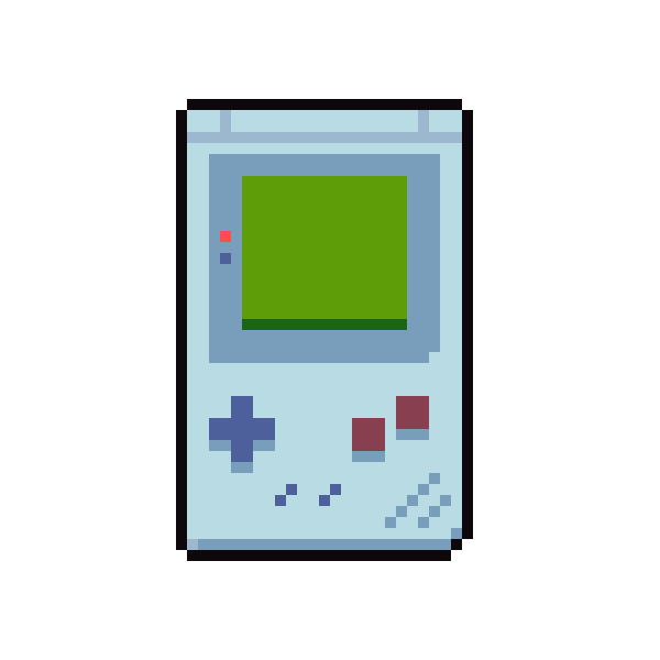
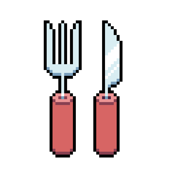
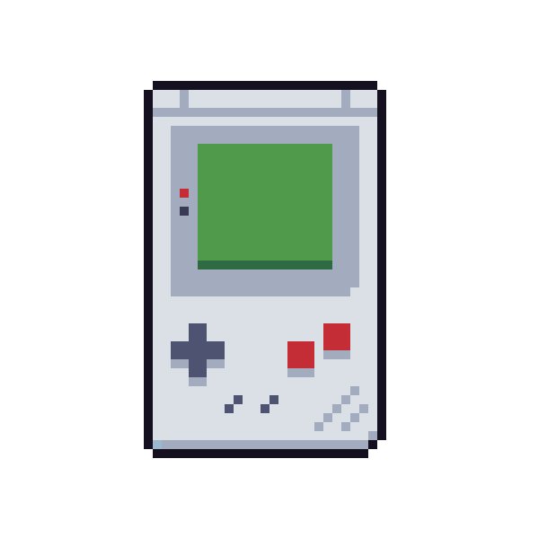
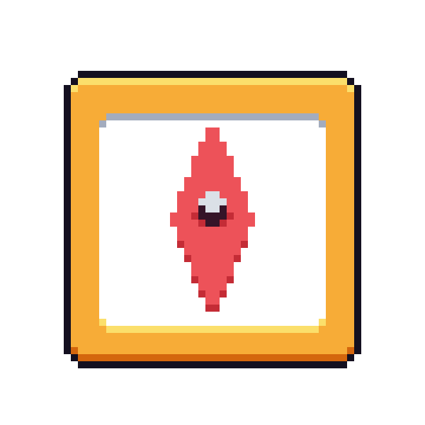
Phun DX (All Icons)


What are you still doing here!
