Rook Coffee
UX/UI Design
Problem –
Rook Coffee’s users' reviews on the app store express users' issues with the user experience on the current application provided by the coffee company rook. Users currently need a guide (posted on their website)on how to operate the application. This could be the result of lost profits for the company, as users are having to struggle through the process of ordering a coffee.Goals –
Improve Rook Coffee’s application by fixing the numerous issues outlined by users and user research, and ultimately alleviate the need for users to use a guide to operate the application and place orders.Role–
UX Designer, UI DesignerSoftware–
Figma, Xmind, Adobe XD,Timeframe–
1.5 Weeks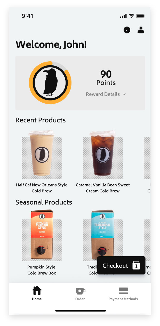


Research –
Before fixing the problems that the users are facing, it is important to make sure that I accurately define a list of the problems. To do this, I looked at the reviews of Rook Coffee’s current application on the Apple App Store, and on the Google Play Store. Following this, I created a competitor analysis of the direct competitors' comparable experiences in the Coffee space.
App Store Reviews –
The user reviews on the app store provide a huge amount of useful statements and data about these problems, and have been used for a majority of the research for this project. It is also crucial that we take the date of the reviews posting into account, as the app has been actively updated on a frequent schedule, and I must verify if the issues these users were having has been fixed since the time of their review. After compiling the information from the user reviews, the summarized list was as follows…

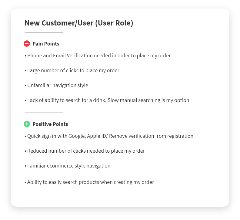
User Personas –
Below are the pain points and positive points of our potential users (Present or past College students or professors) that were informed from the data acquired from the survey, which was documented earlier... ︎

User Journeys (Scenario) –
Following this I outlined the User Journey for both of the User Roles shown above. Below are the scenarios that our user personas go through, again, created with the data gathered from the hundreds of iOS and Google Play Store reviews... ︎︎︎
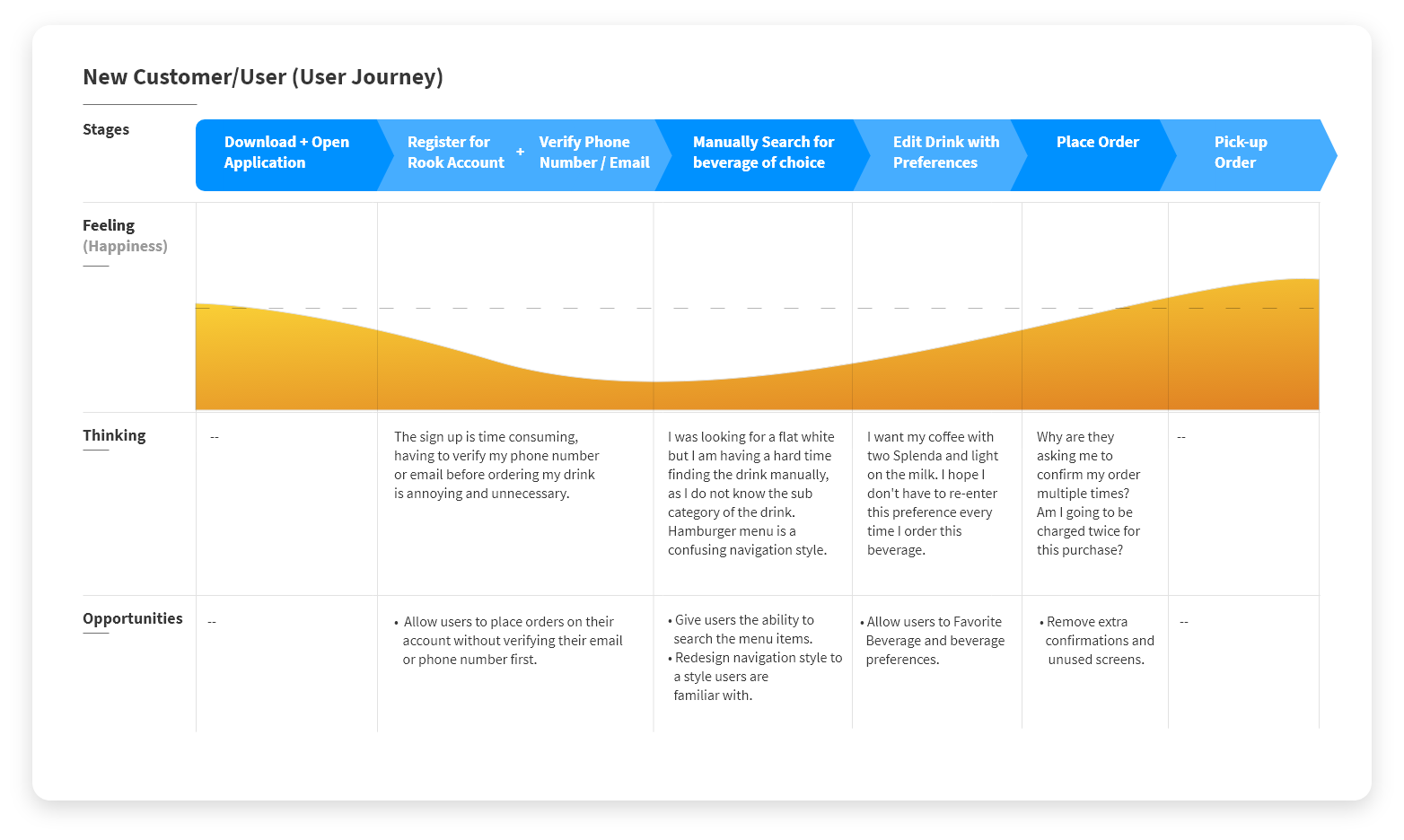
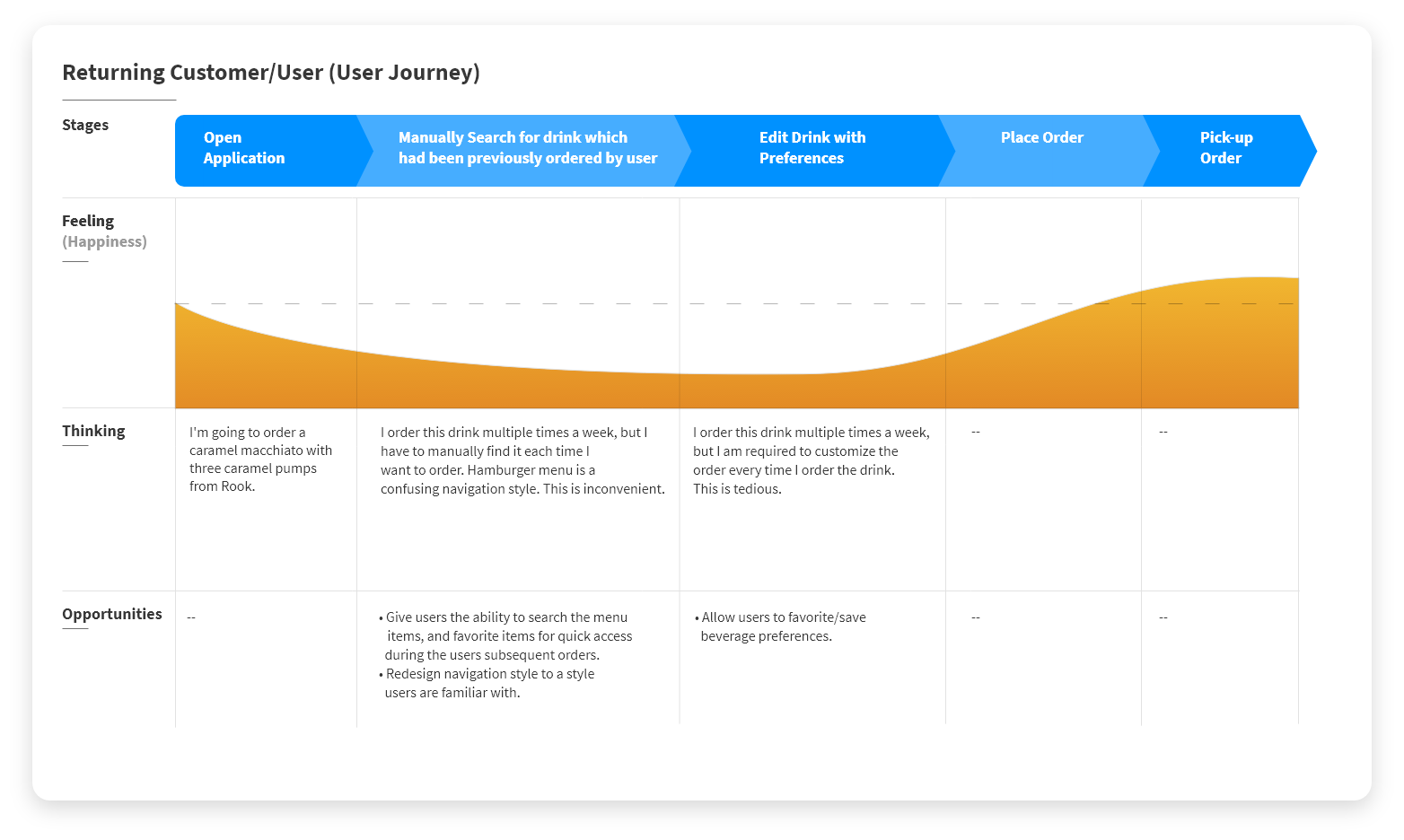
What did I learn? –
Creating the User Personas, the User Journeys (Scenarios) using the App Store, and Google Play Store review data, gave me a definitive list of five issues/opportunities that I could use as a basis for questions and research points in the upcoming competitor analysis.
Competitor Analysis –
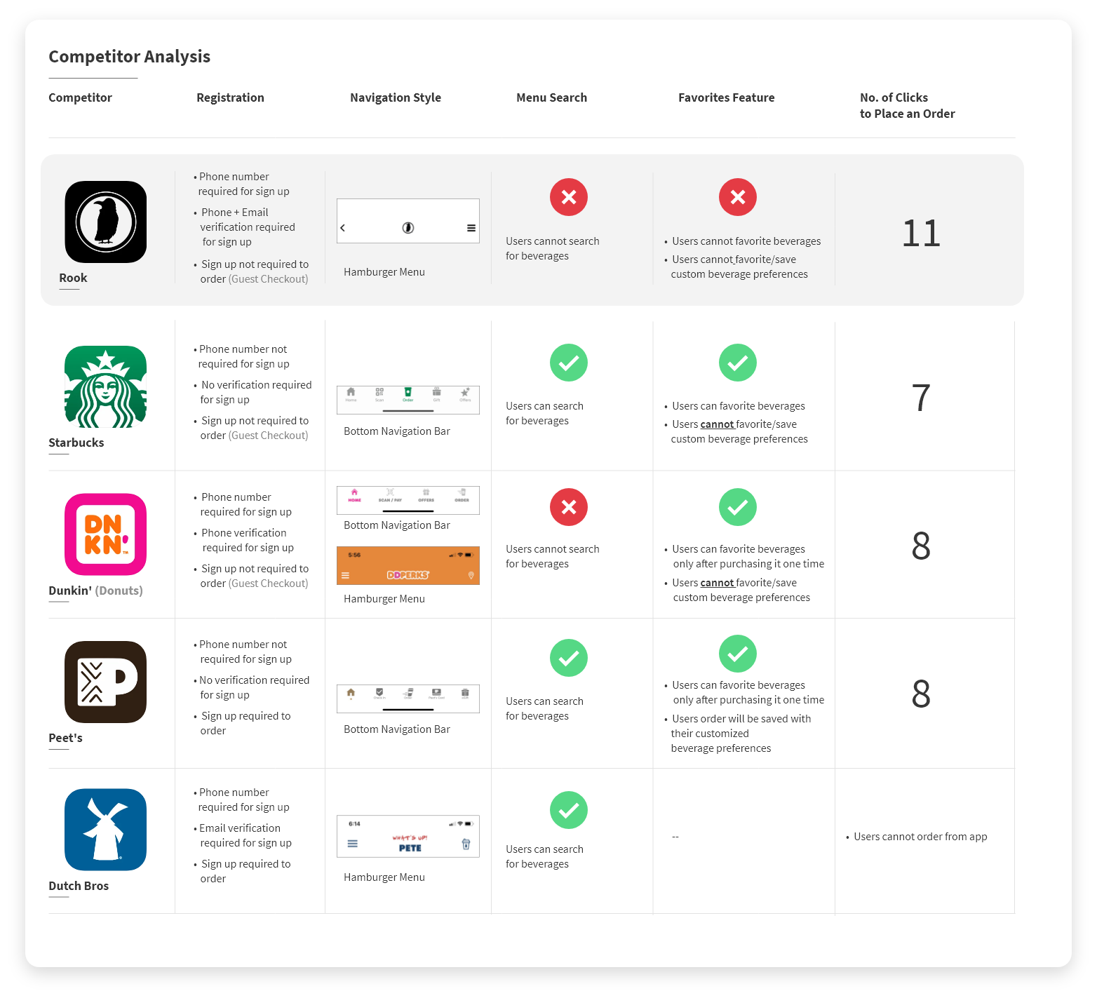
With the User Personas and User Journeys completed, I began my competitor analysis. I researched the applications of four directly competing coffee companies. The four companies chosen were Starbucks, Dunkin’ (Dunkin’ Donuts) Peet’s, and Dutch Bros, all of which have a space in the top 10 list of coffee sellers in the US according to Business Insider.
The competitor analysis focused on asking five questions related to the issues users were having with the Rook app; these will help us set our own design goals by seeing how and if the competitors handled the issues Rook’s users are experiencing. Additionally (and importantly), this will also reveal where the Rook application is falling short in relation to their competition. The five questions are as follows…
- How is registration handled? (Do these companies require you to sign up before ordering, do they need an email or phone verification to create an order using the account?)
-
What navigation style is being used by the company?
-
Do these companies offer a menu search for ease of access?
-
Do these companies provide a favoriting feature? (For drinks? What about customized drink options?)
-
How many clicks does it take to place an order on the competitors applications?
Below is the data collected from the Competitor Analysis... ︎︎︎
What did I learn? –
First, I learned that half of the competitors researched (Dunkin’ and Dutch Bros) require some form of verification (either email or phone) before using your account.
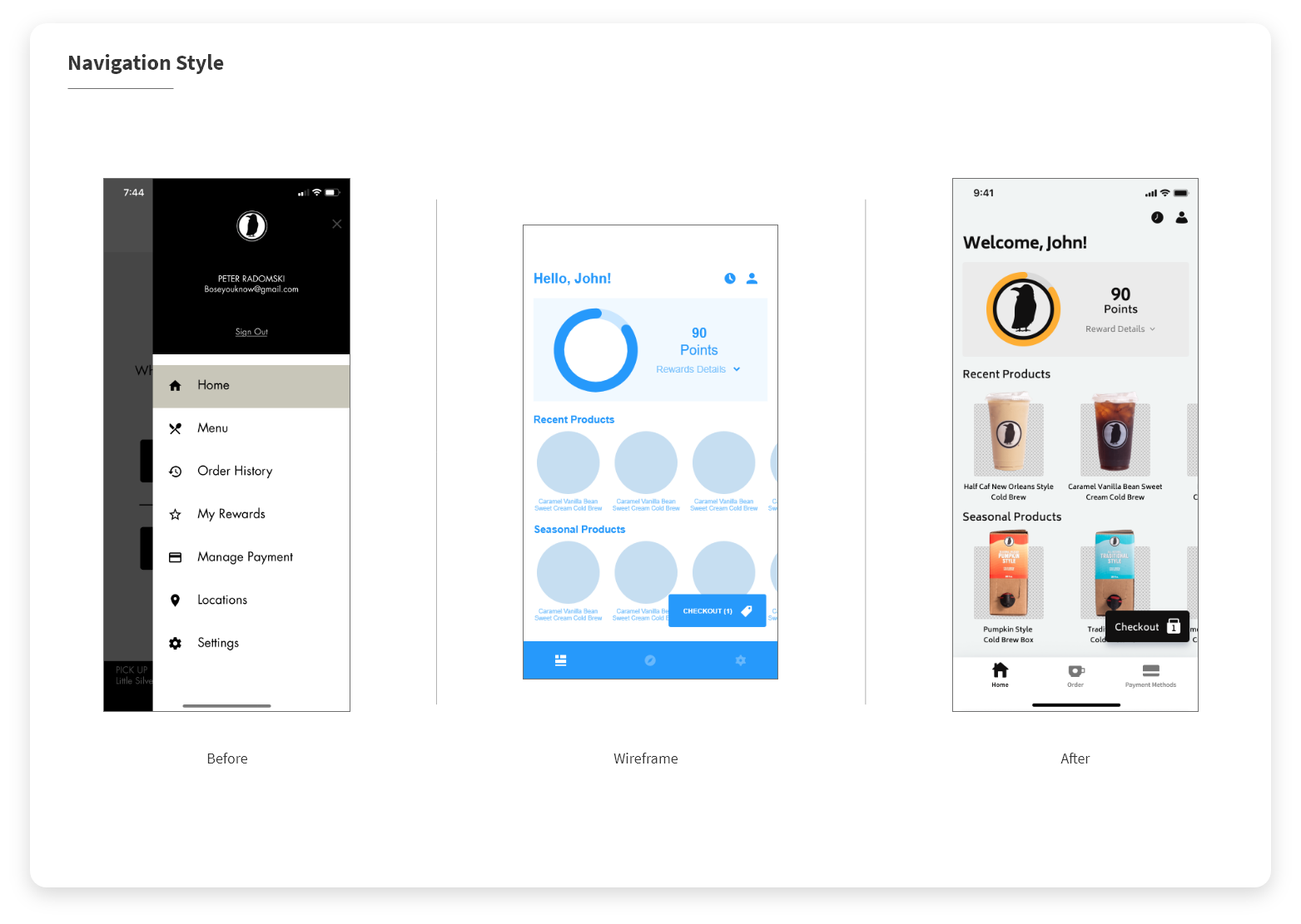
Second, 3 of 4 of the competitors researched make use of a bottom navigation bar style, with Dunkin’ using a sort of hybrid with elements hidden in a hamburger menu, but the main features located on the bottom navigation.
Third, 3 of 4 of the competitors feature the ability to search the menu for products.
Fourth, 3 of 4 of the competitors allow users to favorite products, Dutch Bros does not, as they do not allow mobile ordering. Added to this, it told us that Peet’s is the only competitor I researched that allows users to save a product with their customized preferences. This is a very user friendly feature that Dunkin’ and Starbucks are not yet utilizing, and gives us another great opportunity for improvement.
Lastly, the number of clicks for the Rook Application was way higher than the competitors, around 27% higher.
This data will be used in setting and prioritizing our goals for the application.
Lastly, the number of clicks for the Rook Application was way higher than the competitors, around 27% higher.
This data will be used in setting and prioritizing our goals for the application.
Setting & Prioritizing Goals –
Prioritization Matrix –
With our issues and opportunities outlined, I created a prioritization matrix to narrow focus on the issues that were the most important to solve for the user, but also the most cost effective for the business to pursue a solution for. My criteria for the matrix was User Value (or importance to the user) and Business Effort + Cost to solve. The matrix can be seen below… ︎︎︎

The prioritized list of issues to solve in regard to mutual user and business benefits would be as follows...
- Order Process if too Long
-
Confusing Navigation
-
Long and Cumbersome Registration Process
-
Lack of “Favorite Drinks” feature
-
Poor Reward and Reward Redemption Interface
- Poor Payment Method Interface
Defining Our Goals –
Using all of our research up to this point, it was time to set the goals which serve as my basis of design thinking for the sitemap. The goals were as follows...
- Reduce Amount of Clicks to Order.
- Improve navigation.
- Add the ability for users to favorite their customized beverages.
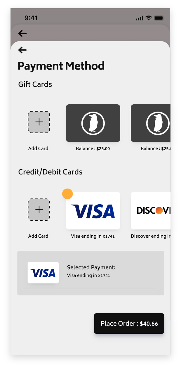
- Improve the checkout process, and payment management.
- Improve rewards and reward redemption.
- Improve registration process.
User Flow (Application Map)–
With everything clearly identified, I moved over to XMind to create the map, the map includes all screens, pop ups, and input fields within the app.
To summarize the choices I made for the map...
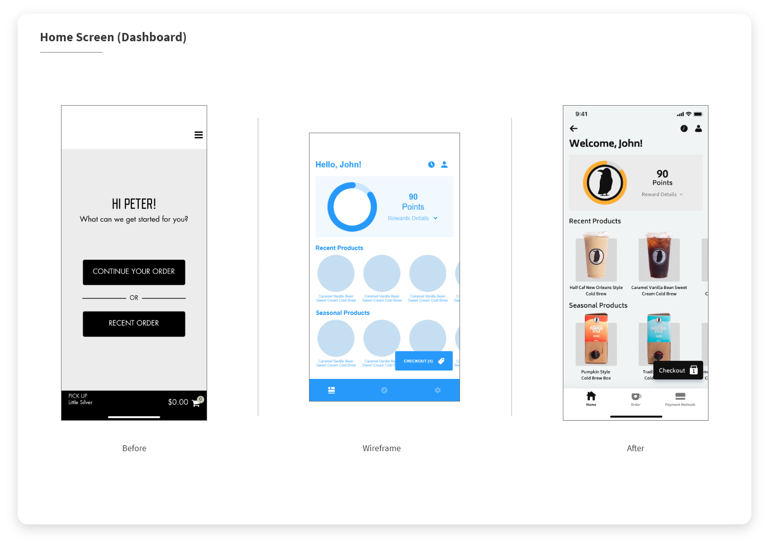
New Homescreen - The user will land on the home screen at launch. This acts as a dashboard; users will be able to see their reward point balance, redeem rewards, and see their previously ordered products. Additionally users will be shown highlighted seasonal items, which will be useful for Rook to promote new products.
New Registration Process - The user will no longer need to confirm their phone number or email before proceeding with an order.
New Checkout Process - Reduce the number of clicks from start to complete an order, the goal will be lower than 11, (current number of clicks) as the competition ranges from 7-8 clicks. Location will be asked for when the user starts their checkout process, this means users can build their order prior to selecting the location they would like to order from.
Product Favoriting Ability - Users will be able to favorite products prior to ordering, when they are reviewing their order. This allows the user to favorite their exact customization for their product. For example… Jack is a user who orders a Hot Coffee, no milk, with two sugar packets every morning, Monday through Friday. Using the old Rook application, Jack would need to customize the order manually every day, but with the favoriting ability, Jack can favorite his customized Hot Coffee when reviewing his order, he can then quickly access and order his favorites quickly from the “Order” page.
Search Functionality - Add the ability for users to search the entire product menu. This will make the process less tedious for the user if they know the name of a drink but do not want to manually look for it.
The navigation is being entirely changed from a hamburger menu to a bottom navigation, this will clear up issues with menu items feeling too confusing, and also puts an emphasis on the main intended use of the application, allow customers to efficiently and quickly place pick-up orders and provide customers with rewards for continued purchases.
The User Flow can be seen below. The Legend on the bottom right is to define what each of the elements is, whether it is a popup, a secondary page, a main page, a button, or an input field, and so on... ︎︎︎
To summarize the choices I made for the map...
New Homescreen - The user will land on the home screen at launch. This acts as a dashboard; users will be able to see their reward point balance, redeem rewards, and see their previously ordered products. Additionally users will be shown highlighted seasonal items, which will be useful for Rook to promote new products.
New Registration Process - The user will no longer need to confirm their phone number or email before proceeding with an order.
New Checkout Process - Reduce the number of clicks from start to complete an order, the goal will be lower than 11, (current number of clicks) as the competition ranges from 7-8 clicks. Location will be asked for when the user starts their checkout process, this means users can build their order prior to selecting the location they would like to order from.
Product Favoriting Ability - Users will be able to favorite products prior to ordering, when they are reviewing their order. This allows the user to favorite their exact customization for their product. For example… Jack is a user who orders a Hot Coffee, no milk, with two sugar packets every morning, Monday through Friday. Using the old Rook application, Jack would need to customize the order manually every day, but with the favoriting ability, Jack can favorite his customized Hot Coffee when reviewing his order, he can then quickly access and order his favorites quickly from the “Order” page.
Search Functionality - Add the ability for users to search the entire product menu. This will make the process less tedious for the user if they know the name of a drink but do not want to manually look for it.
The navigation is being entirely changed from a hamburger menu to a bottom navigation, this will clear up issues with menu items feeling too confusing, and also puts an emphasis on the main intended use of the application, allow customers to efficiently and quickly place pick-up orders and provide customers with rewards for continued purchases.
The User Flow can be seen below. The Legend on the bottom right is to define what each of the elements is, whether it is a popup, a secondary page, a main page, a button, or an input field, and so on... ︎︎︎

Sketches –
With the sitemap complete, I sketched out screens that accompany it. A few of the sketches can be seen below... ︎︎︎

Wireframes + First Prototype –
With my sketches completed, I moved into Adobe XD to create the wireframes for all of the screens in the application. During the creation of the wireframes, I created a functional prototype, this was to test and showcase it's features, how the app functions, to test users, and to the potential developers to ensure everything is clearly explained before going into high fidelity designs. This will also eliminate any chance for confusion later on when the files are passed to the development team.
The successes described and shown in the following UI Design section, were created during the wireframing and Low Fidelity Prototyping stage. I will be highlighting the successes in detail in that section to avoid redundancy. The wireframes can be seen below... ︎︎︎
The successes described and shown in the following UI Design section, were created during the wireframing and Low Fidelity Prototyping stage. I will be highlighting the successes in detail in that section to avoid redundancy. The wireframes can be seen below... ︎︎︎

UI Design –
Once the wireframes and low fidelity prototype were completed, I moved to Figma for designing the UI of the app, and creating a high fidelity prototype which can be used for testing and development. As always, I designed all screen using an 8pt grid and are designed to be fully responsive. Below I will highlight some of the successes achieved with the design, and I will compare them with the previous version of the app when possible (and I will show the accompanying wireframes).
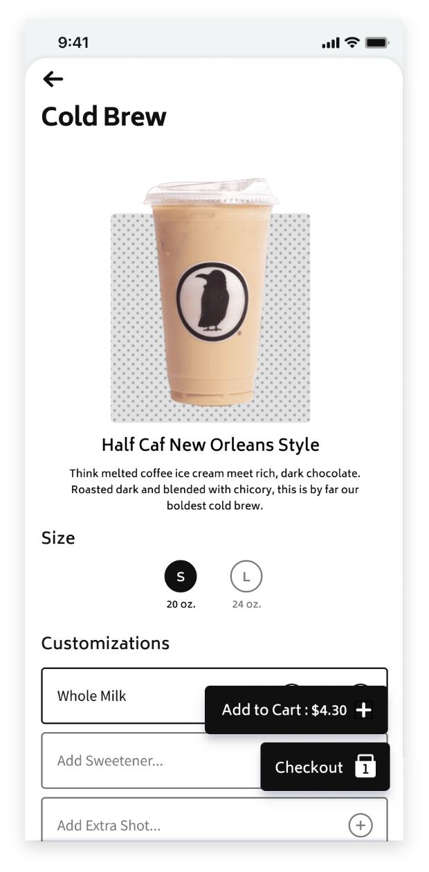
The number of clicks to place an order was reduced by 27%, this reduced our 11 clicks to only 8 clicks, within range of our goal number. (This number can also go even lower when accounting for users who favorited a product, or is re-ordering a product they recent bought) Below is a gif of the high fidelity prototype being used to complete an order start to finish... ︎︎︎
![]()
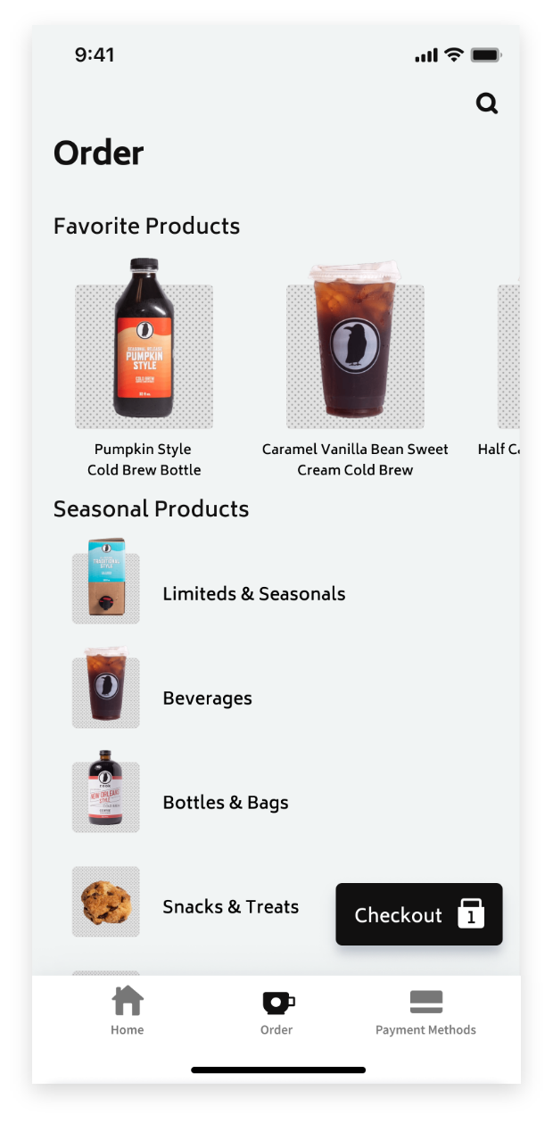
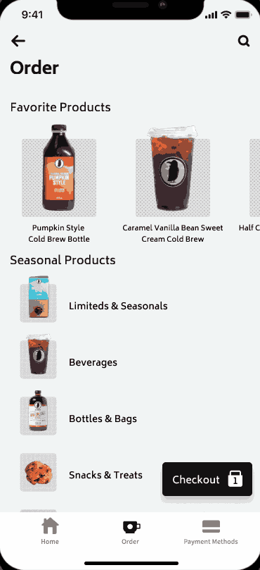
Favorited Products and search are entirely new additions to the application. Favorite products appear at the top of the main order screen, allowing users to quickly access and order their favorites products for a quicker checkout. Favorites can be added by tapping the heart icon from the cart, or from previous orders. This is to allow users to favorite their customized beverage, so they do not have recreate their exact preferences every time they order a favorite (users do not have to reselect that they want oat milk, with two splenda packets). Search can be accessed by tapping the magnifying glass in the top right of the “Order” section of the app. These can be seen in action below... ︎︎︎
![]()
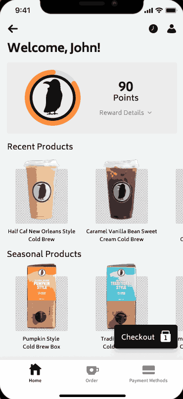
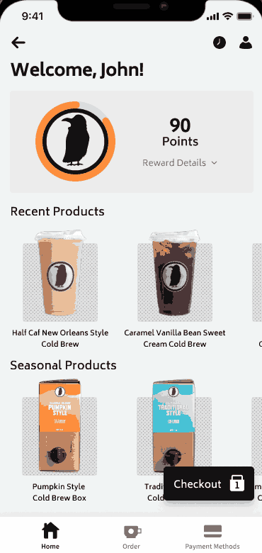
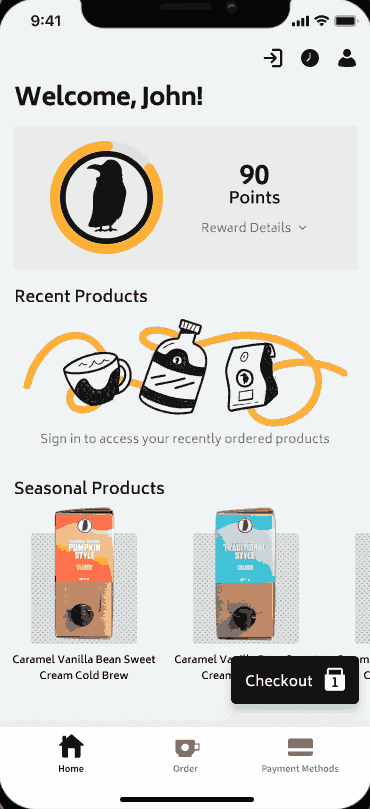
The new home screen acts as a dashboard which showcases the users rewards, products they recently purchased, and Seasonal products. Rewards and reward balances are easier to access and see, the users can easily claim the rewards by selecting them from the accordion style menu. Recently purchased products can be seen with a horizontal scroll on the home screen as well, this allows users to quickly reorder an item without having to go back to a receipt. The Seasonal product horizontal scroll can be used by Rook for promoting limited seasonal products to their customers. This can be seen below... ︎︎︎
![]()
The Rewards section can be seen in action below... ︎︎︎
![]()
In addition to this, users can access their previous orders in full detail using the clock button on the top right of the home page, where they also have the ability to favorite a beverage or product after having purchased (or even simply added to cart). This allows users to favorite a specific personalization, rather than the unpersonalized one (Ex: if a user orders a Cold Brew Coffee with 2 Splenda and Almond Milk multiple times a week, they can favorite it and those preferences will be saved for easy reordering. Favorites can be viewed and accessed on the top of the Order screen, as explained above. Users can also change their account details and log out using the profile button which is found to the right of the clock button. These screens can be seen in action below... ︎︎︎
![]()
Sign up has also been made easier than ever, no longer requiring a email or phone number verification before placing an order. This can be seen in action below...︎︎︎
![]()
Furthermore, navigation has been changed from a hamburger menu, to a bottom navigation, the main features of the application are no longer hidden behind a hamburger menu. The change can be seen below... ︎︎︎
![]()
For the full set of Screens, click HERE︎︎︎. To try the high fidelity prototype yourself, click HERE︎︎︎ or try it below... ︎︎︎ (Figma Embed does not render correctly on mobile. If you are on mobile, click the link!)
Successes –
The number of clicks to place an order was reduced by 27%, this reduced our 11 clicks to only 8 clicks, within range of our goal number. (This number can also go even lower when accounting for users who favorited a product, or is re-ordering a product they recent bought) Below is a gif of the high fidelity prototype being used to complete an order start to finish... ︎︎︎
Favorited Products and search are entirely new additions to the application. Favorite products appear at the top of the main order screen, allowing users to quickly access and order their favorites products for a quicker checkout. Favorites can be added by tapping the heart icon from the cart, or from previous orders. This is to allow users to favorite their customized beverage, so they do not have recreate their exact preferences every time they order a favorite (users do not have to reselect that they want oat milk, with two splenda packets). Search can be accessed by tapping the magnifying glass in the top right of the “Order” section of the app. These can be seen in action below... ︎︎︎
The new home screen acts as a dashboard which showcases the users rewards, products they recently purchased, and Seasonal products. Rewards and reward balances are easier to access and see, the users can easily claim the rewards by selecting them from the accordion style menu. Recently purchased products can be seen with a horizontal scroll on the home screen as well, this allows users to quickly reorder an item without having to go back to a receipt. The Seasonal product horizontal scroll can be used by Rook for promoting limited seasonal products to their customers. This can be seen below... ︎︎︎
In addition to this, users can access their previous orders in full detail using the clock button on the top right of the home page, where they also have the ability to favorite a beverage or product after having purchased (or even simply added to cart). This allows users to favorite a specific personalization, rather than the unpersonalized one (Ex: if a user orders a Cold Brew Coffee with 2 Splenda and Almond Milk multiple times a week, they can favorite it and those preferences will be saved for easy reordering. Favorites can be viewed and accessed on the top of the Order screen, as explained above. Users can also change their account details and log out using the profile button which is found to the right of the clock button. These screens can be seen in action below... ︎︎︎

Sign up has also been made easier than ever, no longer requiring a email or phone number verification before placing an order. This can be seen in action below...︎︎︎
Furthermore, navigation has been changed from a hamburger menu, to a bottom navigation, the main features of the application are no longer hidden behind a hamburger menu. The change can be seen below... ︎︎︎
For the full set of Screens, click HERE︎︎︎. To try the high fidelity prototype yourself, click HERE︎︎︎ or try it below... ︎︎︎ (Figma Embed does not render correctly on mobile. If you are on mobile, click the link!)