Trident Almanac
Layout Design + UX/UI Design (App) + Motion Design
Problem –
Trident Beverage was looking for a solution to overcome their sales force and customers dealing with printed sell-sheets and brandlists.Goals –
• Design the UI and UX of a mobile app version of the Trident Almanac, for iOS and Android.• Design Layouts for 12 alcohol types. Create 13 versions of the book, each tailored to one of the 13 regions.
Client –
“Trident Beverage” is the Emerging & Craft Spirit branch of “Breakthru Beverage Group”. Breakthru Beverage operates throughout the US and Canada, and the team of over 7,000 associates creates over $5 billion in revenue annually.Role–
UI/UX Designer, Layout Designer, Promotion Animator

Premise of App –
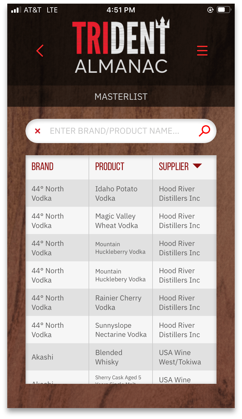
The Trident Almanac App was proposed to create the ultimate version of the Trident Almanac. This would allow users a host of functionality not found on the desktop site, such as the ability to favorite products, cocktail recipes, masterlists for each region that include all available SKUs.
In addition to this, I proposed “Bartinder”, which allows Trident to push a tailored list of products to their customers, who can save an item to their favorite product list (swipe right) or dislike (swipe left) to see the next product.
Designing for Interactivity –
The Trident Almanac allows pages to be interactive. This meant making this a priority when designing the layouts.
This allows users to click on an area of a page to either move them to another page, show them product information, or watch a video. I achieved this through image mapping.
Below the pages can be seen, put into action within the flipbook. ︎

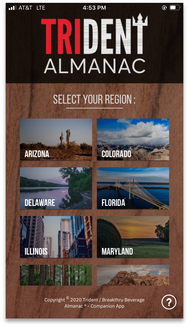
UX Design –

After finishing the flow and functionality of the app, I moved on to the individual screens.
Below are some examples of final screens from the live App. ︎


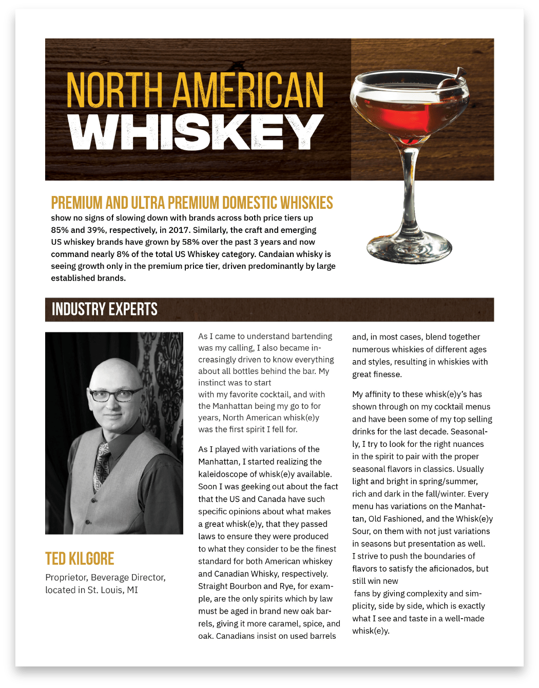
Layout Design –
The design of the Trident Almanac was created to mimic a magazine layout. Each of the 12 Alcohol types recieved their own “chapter” in the almanac.
To create the layouts, I began by looking at all of the content given for each alcohol type. Every type had four necessary components : “Industry Experts”, “Meet the Maker”, and a featured cocktail tutorial.
To create the layouts, I began by looking at all of the content given for each alcohol type. Every type had four necessary components : “Industry Experts”, “Meet the Maker”, and a featured cocktail tutorial.
The “Meet the Maker” pages had the most variation, so I designed two layouts types which could be used depending on the amount of content given. (Ex: If there is a video on the page, use “Type : A”, if there is no video, use “Type : B”)
Below you can see a comparison between a layout the A, and B, layout types. ︎
Below you can see a comparison between a layout the A, and B, layout types. ︎


Promotion Animations –
After the app was pushed live, I continued to manage and update the Almanac with new layout designs, new cocktail videos, and new SKUs, for two years.
I also design and animated promotional videos for the Almanac that were shared via social media. Such as the promotion below ︎
Final –
The Trident Almanac + App is currently used throughout the team at Breakthru Beverage, and their customers. Providing an easy way to pull up an up to date brand sheet, or SKU, no matter their location.
The Trident Almanac is currently live and can be accessed here︎, the app can be downloaded on the App Store︎, Google Play Store︎.